

The best digital experiences feel easy, almost obvious. Behind a site or app that just works is an understanding of how people actually think, feel, and decide. Here are the psychological principles that separate a site people trust and use from one they bounce off.
Why psychology matters in design
Your choices about layout, color, type, and flow shape how people perceive, use, and remember your site.
Applied well, these principles let you:
- Reduce friction and make the site easier to use.
- Make interactions more memorable.
- Build trust and credibility.
- Move people toward the action you want (sign up, buy, share).
Here are the core principles and how to use them.
Cognitive load: keep it simple
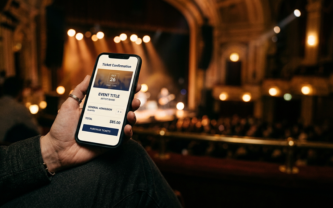
The brain can only process so much at once. “Cognitive load” is the mental effort a task takes. A cluttered site overloads people, which leads to frustration and drop-off. The fix is simplicity. Think of a ticket page that asks for a date, a seat, and payment, and nothing else.
How to apply it:
- Use white space so the page doesn’t overwhelm.
- Group related elements so navigation is obvious.
- Lead with one clear call to action per page.
The payoff: people feel less overwhelmed, decide faster, and are more satisfied.
Trust: you earn it in seconds
Trust is built fast and lost faster. People hesitate to engage with a site that feels off. Consistent design, a professional look, and transparency build credibility immediately. Think about why patrons trust a venue’s checkout: it looks like the venue’s own site, shows every fee up front, and confirms the order instantly.
How to build trust through design:
- Use high-quality images and error-free content.
- Be consistent across the whole experience.
- Make security and policies visible, not hidden.
- Show real proof: reviews, results, named clients.
The rest of the toolkit
A few more principles worth knowing:
- Visual hierarchy. People scan; they don’t read. Size, color, and placement guide the eye to what matters, so the important thing gets seen first.
- The Von Restorff effect. People remember what stands out. Make your primary action visually distinct so it’s the thing they notice.
- Social proof. People look to others to decide. Reviews, testimonials, and “used by” logos lower the risk of acting.
- The peak-end rule. People judge an experience by its most intense moment and its ending. A smooth checkout and a clear confirmation leave a better memory than a flashy homepage and a clunky finish.
What this looks like in ticket buying
These principles show up clearly when someone buys a ticket. A seat map with prices shown on the map keeps the load light. A checkout that stays in the venue’s own look and feel keeps trust intact. A clear confirmation, sent instantly, is the "end" patrons remember.
When we rebuilt the purchase path for Scottsdale Arts around how patrons actually behave, abandoned carts fell by 88%.
Design for how people actually behave
Great digital experiences aren’t about the most features or the slickest look. They’re built around how people think and decide: keep the load light, earn trust fast, guide the eye, and make the important action obvious. Do that, and the site feels intuitive, because it’s working with human nature instead of against it.
That’s how we approach experience design: grounded in how people actually buy and behave, as well as how a page looks. Let’s talk →